



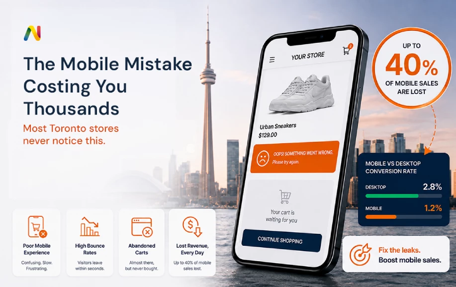
Are you a store owner in the GTA looking at your monthly numbers and asking, Why is my mobile conversion rate low? You are definitely not alone. Every day, business owners across the city watch their traffic numbers go up, but their mobile sales stay flat. They see people visiting their online shops from phones, but those people leave without buying anything. This is a huge problem. You are losing money. But the good news is that an experienced eCommerce agency in Toronto can help you figure out exactly what is going wrong and how to fix it fast.
Why are Toronto e-commerce stores losing mobile sales?
Toronto eCommerce stores often see a 40% drop in mobile sales due to three hyper-local factors:
- Network Latency: High-traffic areas (such as Union Station or the Financial District) cause slower load times on 5G and LTE networks. If a site isn't optimized for speed, users bounce away immediately.
- Payment Friction: There is a lack of localized mobile wallet integration (like Apple Pay or Google Pay) for Canadian CAD processing. People hate typing out credit card numbers on a small screen.
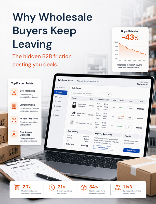
- Non-Responsive B2B Portals: Toronto B2B buyers frequently use mobile devices for quick re-orders while on job sites. Difficult navigation leads to 40% higher cart abandonment than on desktop.
- Solution: Implement headless commerce or PWAs (Progressive Web Apps) to ensure instant loading across the GTA, keeping shoppers happy and buying.
The Toronto Commuter Reality
Life in the Golden Horseshoe moves fast. People are always on the go. They are walking to the subway, rushing to grab a coffee, or heading to a meeting. Because they are so busy, they use their phones for everything. They read the news, talk to friends, and most importantly, they shop. But shopping on a phone in a busy city is very different from shopping on a computer at a quiet desk. If you want to understand why your store is losing money, you have to understand the reality of the daily commute.
Contrast desktop vs. mobile conversion rates in the GTA
Let us look at the numbers. They tell a very clear story. When someone sits at a desk with a big screen, a mouse, and a fast Wi-Fi connection, they are happy to shop. They click around, look at pictures, and take their time. In the GTA, desktop conversion rates (the number of people who actually buy something) are usually pretty healthy. They might be around 3% or 4%. This means that out of 100 people, three or four will buy a product.
Now, look at the mobile numbers. It is a completely different story. Mobile traffic is huge. More than half of your visitors are probably using a phone. But the conversion rate drops. It falls to 1% or maybe even lower. That means you are losing a massive 40% of your possible sales just because the person is holding a phone instead of using a mouse.
Why is this gap so big? Is it because people do not want to buy things on their phones? No. People love buying things on their phones. The problem is that your website is making it too hard for them. When you make it hard, people quit. They leave items in their cart and close the page. This is exactly why you need to fix mobile checkout abandonment strategies in GTA to close that giant gap.
Why does Toronto’s fast-paced environment make a 3-second lag feel like an eternity?
Imagine a person named Sarah. Sarah works in Downtown Toronto. She just finished a long day at the office. She walks down into the subway station. It is crowded, loud, and she is tired. While she waits for her train, she remembers she needs to buy a gift for her friend. She pulls out her phone and goes to your website.
Here is the problem. Sarah has about three minutes before her train arrives. She is not sitting in a quiet room. She is standing in a noisy station. If your website takes 4 seconds to load a product picture, Sarah gets annoyed. Four seconds feels like an hour when you are in a rush.
If the page is slow, she will hit the "back" button. She will go to a giant online store that loads instantly instead. In a fast-paced city, patience is in short supply. A three-second delay will kill your sale. Your website must be as fast as the city itself. If not, you will keep losing customers to competitors with faster sites.
Identifying the "Mobile Leaks"
We now know people are leaving your store. The next step is to find out exactly where they are leaving. We call these "mobile leaks." Imagine your website is a bucket holding water. The water is your customers. If there are holes in the bucket, the water leaks out before you can carry it to the finish line. We need to find those holes and plug them up. Here are the three biggest leaks we see in local online shops.
Technical Bloat: Heavy images and scripts are killing load times on the TTC
The first massive leak is called technical bloat. This means your website is too heavy. Think of a website like a backpack. If you fill a backpack with heavy rocks, it is hard to carry. If your website is full of massive, high-definition images and complicated computer code, it is too heavy for a phone to carry quickly.
When someone is commuting on the TTC (Toronto Transit Commission), their cell phone signal goes up and down. Sometimes they have full 5G speed. Other times, like when they go underground, the signal drops to almost nothing. If your website tries to load a giant banner image while someone has a weak signal, the phone gives up. The screen goes blank. The little loading wheel spins forever.
Many store owners want their site to look beautiful. They upload huge photos. But a phone screen is small. You do not need a huge photo for a small screen. You need smart code that squishes the photo down so it loads in a split second. Getting rid of this bloat is the first step to keeping people on your page while they're on the go.
The "Fat Finger" Syndrome: Buttons and forms not optimized for the Canadian winter
The second big leak concerns how people actually use their phones. This is a very Canadian problem. For many months of the year, it is freezing outside. People are walking down the street wearing gloves. Even with those special gloves that work on screens, it is still very hard to be precise.
This leads to "Fat Finger" Syndrome. This happens when the buttons on your website are too small or placed too close together. A customer tries to click "Add to Cart" but accidentally clicks "Delete" or "Help." They get frustrated. They have to zoom in, scroll around, and try again. If they have to do this while standing in the cold, they will just put their phone back in their pocket.
Another big issue here is forms. When someone is ready to buy, they have to enter their contact details, address, and email address. Never leave the text boxes too tiny. To stop this leak, you must consider building contact forms that convert. This clearly means making the boxes big, clear, and easy to tap, even with a gloved hand on a freezing January morning.
Currency & Shipping Friction: Showing USD or failing to provide "Click and Collect" options for Toronto locations
The third leak is all about local expectations. When a person in the GTA shops on a local website, they expect local service. The biggest shock a buyer can get is reaching the checkout page and seeing that the price is actually in United States Dollars (USD). They thought an item was fifty dollars, but suddenly it was almost seventy dollars. This instantly breaks their trust, and they leave the cart behind.
Shipping is another huge friction point. People do not want to wait two weeks for a package to come from across the border if the store is just down the highway. Customers in the Golden Horseshoe expect a "Click and Collect" option. This is also called BOPIS (Buy Online, Pick Up In Store).
If a customer lives in Mississauga and your warehouse is in Etobicoke, they might drive over and pick up the item today. If you do not offer this choice, or if it is hard to find on the mobile site, you lose the sale. You have to make sure your site feels local, prices are local, and it ships locally.
Deep Dive into B2B: Why Wholesale Buyers are Bouncing
Many people think e-commerce is just for buying clothes or shoes. But Business-to-Business (B2B) sales are a massive part of the economy. In fact, many companies sell exclusively to other businesses. Plumbers buy pipes, offices buy paper, and restaurants buy food all through online portals. This is an area where mobile design often fails.
Non-Responsive B2B Portals
Picture a busy contractor. Let's call him Mike. Mike is standing in the middle of a messy construction site. He realizes he needs to order fifty more boxes of nails for tomorrow. He does not have time to go back to his office, sit down at a desktop computer, and log in. He pulls out his phone right there in the dirt.
If your B2B website is old and non-responsive, Mike is going to have a terrible time. Non-responsive means the website does not adapt to fit a phone screen. It just looks like a tiny version of a computer screen. Mike has to pinch the screen to zoom in. He has to scroll left and right just to read a sentence. He has to poke around tiny links to find his past orders.
Because the site is so hard to use, Mike gets mad. He abandons his cart. This is why non-responsive portals lead to 40% higher cart abandonment. If you sell to other businesses, you must make re-ordering easy on the phone. The best way to fix this is to get a professional Toronto B2B eCommerce UX audit. An audit is a deep check-up of your site. It will show you exactly why contractors like Mike are giving up and going to your competitors instead.
The Fix: The 3-Step Optimization Sprint
We have talked a lot about the problems. Now it is time to talk about the solutions. You do not have to throw your whole website in the trash and start over. Most of the time, you need a focused plan to fix the leaks. We call this the 3-Step Optimization Sprint. By focusing on these three specific fixes, you can see a massive jump in your mobile sales very quickly.
Biometric Checkout: Integrating one-tap payments to bypass manual entry
The hardest part of buying anything on a phone is typing in a credit card number. It is a long string of numbers. You have to find your wallet, pull out the card, and type carefully. If you make one mistake, the payment fails. People hate doing this, especially if they are sitting on a bumpy bus.
The fix for this is biometric checkout. Biometric sounds like a fancy science word, but it just means using your fingerprint or your face to approve a payment. Have you ever used Apple Pay or Google Pay? You check your phone or press the button, and the payment is complete. It takes one tap. It takes zero typing.
It is high time you understood that if your store lacks Apple Pay or Google Pay, then literally you are living in the past. Adding these convenient payment options is the fastest way to help people finish their purchases. They see something they like, they tap the button, and it is bought. No wallets, no typing, no mistakes. This one change is a total game-changer for your business.
Thumb-Zone Navigation: Moving critical CTAs to the bottom of the screen
Pick up your phone right now. How are you holding it? If you are like most people, you are holding it in one hand. You use your thumb to scroll and click. Now, look at the screen. What part of the screen is easiest for your thumb to reach? It is the bottom half. The top of the screen is very hard to reach without using your other hand or stretching your thumb uncomfortably.
We call the bottom half of the screen the "Thumb-Zone." If you want people to click a button, that button needs to be in the Thumb-Zone. Sadly, many websites put their most important buttons (like the menu or the shopping cart) at the very top of the page. This is bad design for mobile users.
To fix this, you need to flip your design upside down. Move the "Add to Cart" button to the bottom of the screen so it is always right under the user's thumb. Make it big. Make it bright. Make it the easiest thing to touch. We call these buttons CTAs, which stands for Call To Action. When your CTAs are in the Thumb-Zone, people click them more often. It is simple human nature.
Local CDN Caching: Serving data from Toronto-based servers for sub-second delivery
Remember how we talked about website speed? We said your site needs to be lightning fast. One of the best ways to make a site fast is to put the data physically closer to the customer. This is done using a CDN, which stands for Content Delivery Network.
Think of a CDN like a pizza delivery chain. If there is only one pizza kitchen in the whole country, it will take days to deliver a hot pizza. But if there are kitchens in every city, the pizza arrives hot and fast. A CDN works the same way for website files. It stores copies of your pictures and code on servers all over the world.
If your main server is in California, and a customer in Downtown Toronto tries to open your page, the data has to travel thousands of miles. That takes time. But if you use a CDN, the customer connects to a server right here in the city. The data only has to travel a few miles. This means the page loads in a fraction of a second. If you want this set up perfectly, you need a highly skilled Shopify Plus Developer Toronto to connect the plumbing correctly. It makes a massive difference in speed.
Next-Level Upgrades: Headless Commerce and PWAs
If you have completed the 3-step sprint and still want more power, it is time to look to the future of online selling. For stores doing high volumes of sales, the basic platforms are sometimes not enough. You need truly cutting-edge web development to stand out from the crowd. Two of the best ways to do this are Headless Commerce and Progressive Web Apps (PWAs).
What is Headless Commerce?
Most websites are built like a normal house. The front of the house (what the customer sees) is permanently glued to the back of the house (where the data and inventory live). If you want to change the front, you have to mess with the back. This makes the whole house very slow to update.
Headless commerce chops the head off. It separates the front of the site from the back. This means the front of the site can be incredibly fast and lightweight. It acts like a speeding bullet because it doesn't have to carry the heavy backend database with it all the time. Only top-tier Shopify Plus Toronto Experts have the skills to build a headless store, but the results are amazing. Pages load instantly, even in poor cell signal areas.
What is a PWA?
A PWA is a Progressive Web App. It is a website that acts exactly like a normal app you would download from the app store. But the customer does not have to go to an app store or download anything. They go to your website, and it feels like an app.
PWAs are amazing for mobile sales. They can send push notifications (like text messages) to remind people about items left in their cart. They can even work offline! If a commuter loses their signal in the subway, they can still browse your catalog. When they get their signal back, the app automatically updates. This is the absolute peak of Toronto Shopify experts' mobile checkout optimization. If you build a PWA, you destroy the friction that causes cart abandonment.
Understanding the Investment and Finding the Right Partner
At this point, you might be thinking, "This all sounds great, but how much is it going to cost me?" That is a very smart question. Fixing these problems is an investment in your business. It is not an expense. An expense is money that is gone forever. An investment is money you spend to make more money.
Before you start tearing your website apart, it is helpful to look at an E-commerce cost breakdown. Building a lightning-fast, mobile-optimized site requires a team of experts. You need designers who understand the thumb zone. You need coders who understand local server caching. You need experts who know how to set up one-tap biometric payments.
Trying to do this yourself with cheap templates will only lead to more leaks in your bucket. You need a trusted partner. You need the Best eCommerce CRO agency for Toronto retail. CRO stands for Conversion Rate Optimization. This means their only job is to turn more of your visitors into paying customers. They do not just make things look pretty; they use math, data, and testing to prove that their changes make you more money.
When you hire the right team, the investment pays for itself. Imagine if you could stop losing that 40% of your mobile sales. Think about what that would do to your monthly profits. The cost of upgrading your site is very small compared to the massive amount of money you are losing every single day by doing nothing.
The B2B Conversion Closer (CTA)
You have read the facts. You understand the data. You know that the Toronto commuter reality is destroying your mobile sales. Heavy images, clunky checkout forms, and non-responsive designs are pushing your customers straight into the arms of your competitors. The "Fat Finger" syndrome and Apple Pay's lack are costing you thousands of dollars a week.
But it does not have to be this way. You do not have to accept a 1% conversion rate on mobile devices. You have the power to stop the bleeding today.
Are you a GTA-registered business ready to fix your mobile leaks and dominate the local market? Stop guessing and start knowing. It is time to get a professional set of eyes on your digital storefront. We invite you to claim your Free Mobile Performance Audit. The team of the finest experts will literally dig deep into your code, test your checkout process, and show you exactly where you are losing money on mobile devices. We will give you a clear, easy-to-understand roadmap to fix the problems and get your sales moving in the right direction.
Do not wait for another customer to abandon their cart. Contact Netclues and claim your Free Mobile Performance Audit today. Let's build a store that converts!
Frequently Asked Questions About Mobile Ecommerce Optimization
Q.1. Why is my ecommerce mobile conversion rate lower than desktop?
A. Mobile conversion rates are often lower because smartphone shoppers face more friction: smaller screens, slower connections, difficult forms, distracting environments, and cumbersome checkout flows. Review mobile page speed, navigation, product discovery, payment options, form usability, and checkout abandonment separately. Comparing mobile and desktop funnel data can reveal exactly where the largest conversion gap occurs.
Q. 2. What is mobile ecommerce optimization?
A. Mobile ecommerce optimization is the process of improving an online store specifically for smartphone shoppers. It covers page speed, responsive design, navigation, product pages, forms, payments, checkout, accessibility, and technical performance. The goal is to make browsing and purchasing easy on smaller screens while reducing unnecessary steps and friction throughout the mobile customer journey.
Q. 3. How can I improve mobile checkout conversion?
A. Start by reducing unnecessary checkout steps and form fields. Offer express payment methods such as Apple Pay or Google Pay where supported, make input fields easy to tap, provide clear shipping costs and delivery information, and minimize distractions. Test the checkout on different phones and measure abandonment at each step rather than relying only on the overall conversion rate.
Q. 4. Does Apple Pay improve ecommerce conversion rates?
A. Mobile wallets can reduce checkout friction because customers may not need to manually enter card details, billing information, or other payment data. Their impact varies by audience, device, market, and implementation, so stores should measure results rather than assume a universal conversion increase. Offering familiar payment methods can nevertheless make mobile checkout faster and easier.
Q. 5. How fast should an ecommerce website load on mobile?
A. Aim for strong real-world performance rather than relying on a single headline load-time number. Google's Core Web Vitals provide useful measures of loading performance, responsiveness, and visual stability. Optimize images, JavaScript, CSS, fonts, third-party scripts, caching, and server delivery, then test using realistic mobile conditions to identify bottlenecks that affect actual shoppers.
Q. 6. Does a CDN make a Toronto ecommerce store faster?
A. A content delivery network can improve delivery of cacheable assets by serving them from infrastructure geographically and network-wise closer to users. However, a CDN does not automatically make every page fast, and it does not guarantee a Toronto-based server for every request. Backend performance, caching strategy, images, JavaScript, database operations, and third-party services also influence mobile speed.
Q. 7. What should a mobile B2B ecommerce portal include?
A. A mobile B2B portal should prioritize fast reordering and account-specific workflows. Useful features include saved products, previous orders, quick reorder functionality, searchable catalogs, customer-specific pricing, quantity controls, easy access to invoices, and streamlined approval processes. The interface should remain usable on phones at warehouses, construction sites, offices, and other environments where buyers may not have access to a desktop.
Q. 8. Should an ecommerce business build a PWA or headless store?
A. A PWA or headless architecture can provide benefits, but neither should be treated as an automatic conversion solution. A PWA can enhance app-like experiences, while headless commerce separates the presentation layer from commerce functionality. Before investing, assess traffic, business complexity, existing platform limitations, performance requirements, development resources, maintenance costs, and the measurable problems the architecture is expected to solve.
Q. 9. How much does mobile ecommerce optimization cost?
A. The cost varies substantially depending on whether the work involves UX improvements, performance optimization, checkout changes, payment integrations, platform development, or a complete architectural rebuild. A focused audit and optimization sprint generally requires less investment than rebuilding a storefront with headless commerce or a PWA. The appropriate budget should follow the size and business impact of the identified problems.
Q. 10. How long does it take to improve mobile ecommerce performance?
A. Simple improvements such as image optimization, layout fixes, unnecessary-script removal, and checkout UX changes can often be implemented relatively quickly. Larger projects involving platform integrations, custom development, headless architecture, or PWAs take longer. A practical process is to audit first, prioritize high-impact issues, implement changes in stages, and validate each change through analytics and testing.
Q. 11. What are the biggest mistakes in mobile ecommerce optimization?
A. Common mistakes include designing primarily for desktop, using oversized images, loading unnecessary scripts, making buttons or form fields difficult to tap, hiding shipping information, offering limited payment choices, and adding excessive checkout steps. Another mistake is changing the site without measuring results. Analytics, funnel analysis, usability testing, and controlled experiments can help distinguish genuine improvements from assumptions.
Q. 12. How can I tell where my mobile ecommerce store is losing sales?
A. Use analytics to compare the mobile and desktop funnels from landing page through purchase. Examine product-page engagement, add-to-cart rate, checkout initiation, payment errors, checkout abandonment, page performance, and device-specific behavior. Combine quantitative data with session recordings or usability research where appropriate. A mobile UX and performance audit can then turn those findings into a prioritized optimization roadmap.